Role: solo founder: research, product design, design system and front end
Timeline: 2024 to now. First Figma prototype in 2024, in production since 2025
Platform: web, desktop first, works down to phone width
Users: 12,000+
WahResume helps job seekers rewrite the resume they already have so it speaks each job’s language, without the AI inventing anything. I designed and built it end to end. Below are the three decisions that shaped it most.
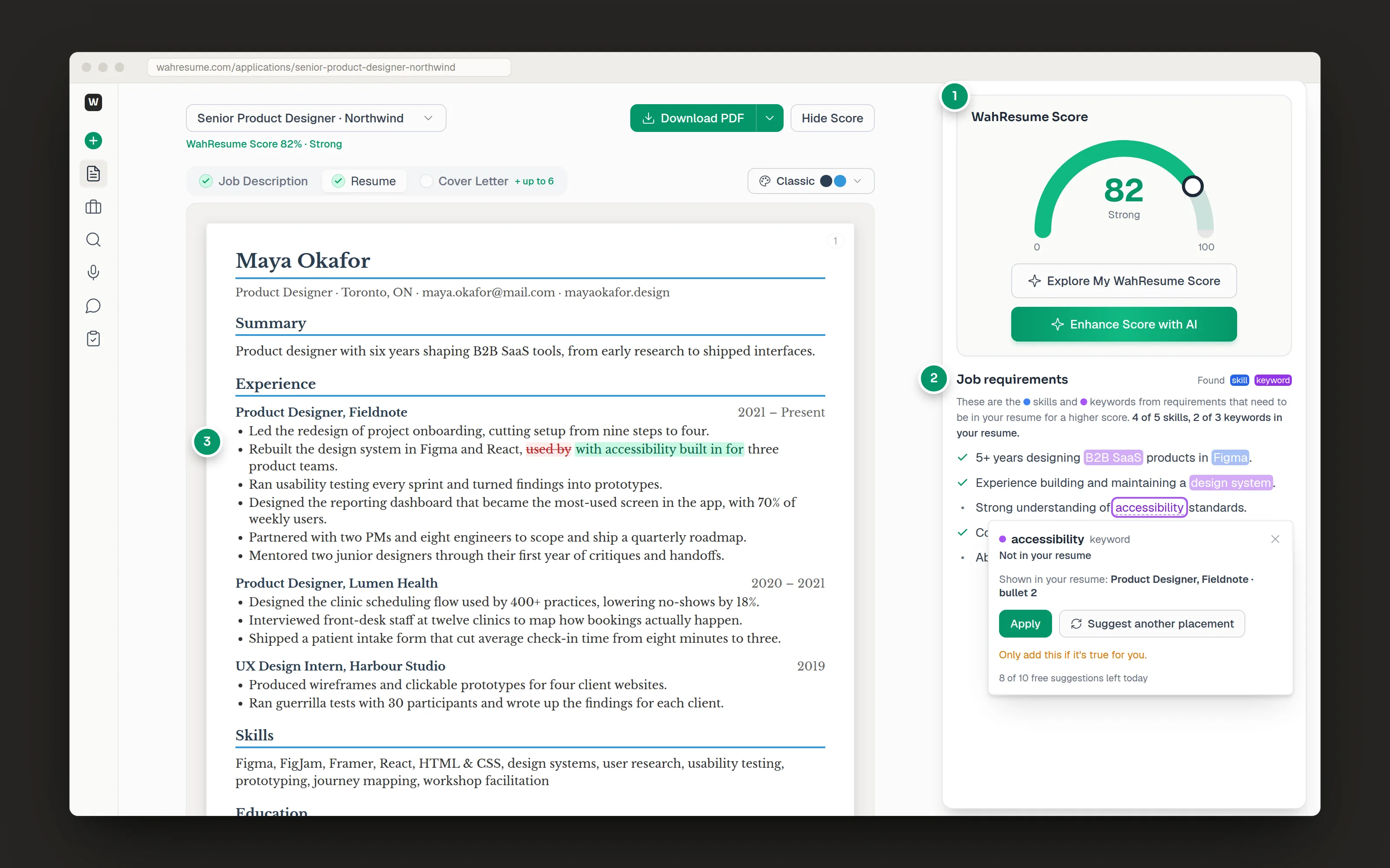
1The score
2The job requirements
3The placement preview
The candidate and job are fictional.
The problem
Companies need people and still reject millions of resumes before a person reads them. Kathryn Dill’s piece in the Wall Street Journal put a name to what I was living through in my own job search. Applicant tracking systems (ATS) filter on the job’s own skills and keywords, so one well-made general resume keeps losing to people who rewrite for every job.
Rewriting for every job is slow, though. The tools I tried did one piece each: Jobscan scored, builders formatted, chat tools rewrote. Nothing joined them up, and the AI rewriters were happy to make things up.
Who it’s for, and what I heard
I designed for people applying to many roles at once. I talked to recruiters and other job seekers, and spent a long stretch applying myself. Three things stood out:
They don’t need a template. They have a resume. They need the same true story told in each job’s words, quickly.
A score needs a next step. A match percentage only helps if it shows what to change and where.
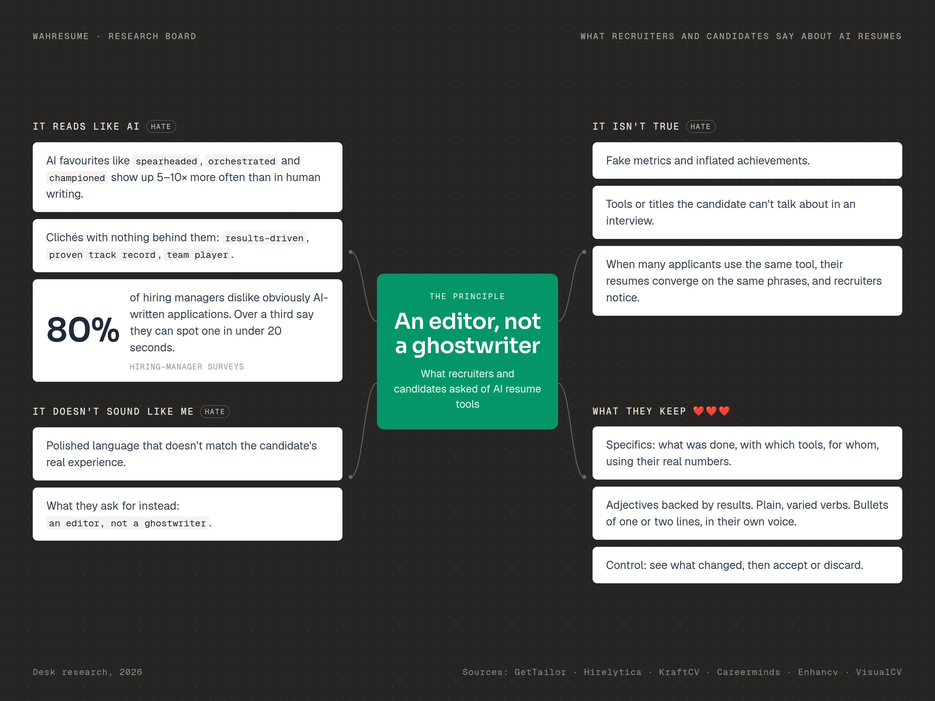
They don’t trust AI that writes for them. They want to see what changed, and to keep the final say.
That last one became the principle behind every AI feature: an editor, not a ghostwriter.
From desk research into what recruiters and candidates say about AI resume tools. The sources are listed on the board.
Process: Figma first, then code
I started in Figma in 2024. I mapped the whole loop as a flow, wireframed the key screens, and built a clickable prototype of the tailoring step so I could test the loop before writing any code.
Once the flows held up, I built a component library in Figma and mirrored it in code with shadcn/ui and Tailwind, so a change to the library had an obvious place to go in the product. From there I worked in short loops: sketch the change in Figma, ship it, watch how people used it, adjust.
app.wahresume.com/base-resume
Base resume
Add your base resume
This is the starting point for all your future tailored resumes, mock interviews and other features.
Import resume
Import your resume
This resume becomes your base resume, the starting point for your future tailored resumes.
Drag & drop your resume here, or Browse filesPDF or DOCXmaya-okafor.pdf 148 KB
CancelImport resume →
Reading fileAnalyzingSaving
Maya OkaforProduct Designer · Toronto, ON · maya.okafor@mail.com · mayaokafor.designSummary
Product designer with six years shaping B2B SaaS tools, from early research to shipped interfaces.
Experience
Product Designer, Fieldnote2021 – Present
Led the redesign of project onboarding, cutting setup from nine steps to four.
Rebuilt the design system in Figma and React, used by three product teams.
Ran usability testing every sprint and turned findings into prototypes.
Designed the reporting dashboard that became the most-used screen in the app, with 70% of weekly users.
Partnered with two PMs and eight engineers to scope and ship a quarterly roadmap.
Mentored two junior designers through their first year of critiques and handoffs.
Product Designer, Lumen Health2020 – 2021
Designed the clinic scheduling flow used by 400+ practices, lowering no-shows by 18%.
Interviewed front-desk staff at twelve clinics to map how bookings actually happen.
Shipped a patient intake form that cut average check-in time from eight minutes to three.
UX Design Intern, Harbour Studio2019
Produced wireframes and clickable prototypes for four client websites.
Ran guerrilla tests with 30 participants and wrote up the findings for each client.
Skills
Figma, FigJam, Framer, React, HTML & CSS, design systems, user research, usability testing, prototyping, journey mapping, workshop facilitation
Not in your resumeSuggest a placementFinding a natural place in your resume…
Shown in your resume: Fieldnote · bullet 2
ApplySuggest another placement
Only add this if it's true for you.
Added “accessibility” Undo
Maya OkaforProduct Designer · Toronto, ON · maya.okafor@mail.com · mayaokafor.designSummary
Product designer with six years shaping B2B SaaS tools, from early research to shipped interfaces.Product designer with six years shaping B2B SaaS tools, from research and prototyping to shipped, accessible interfaces.
Experience
Product Designer, Fieldnote2021 – Present
Led the redesign of project onboarding, cutting setup from nine steps to four.
Rebuilt the design system in Figma and React, with accessibility built in for three product teams.
Ran usability testing every sprint and turned findings into prototypes.
Designed the reporting dashboard that became the most-used screen in the app, with 70% of weekly users.
Partnered with two PMs and eight engineers to scope and ship a quarterly roadmap.
Mentored two junior designers through their first year of critiques and handoffs.
Product Designer, Lumen Health2020 – 2021
Designed the clinic scheduling flow used by 400+ practices, lowering no-shows by 18%.
Interviewed front-desk staff at twelve clinics to map how bookings actually happen.
Shipped a patient intake form that cut average check-in time from eight minutes to three.
UX Design Intern, Harbour Studio2019
Produced wireframes and clickable prototypes for four client websites.
Ran guerrilla tests with 30 participants and wrote up the findings for each client.
Skills
Figma, FigJam, Framer, React, HTML & CSS, design systems, user research, usability testing, prototyping, journey mapping, workshop facilitation
Enhance Score with AIWhat should AI improve for this job?
Rewrite summary up to +6
Rewrite recent experiences up to +8
Add missing skills & keywords up to +5
Match my job titles up to +3
Changes: summary, recent experiences, skillsEnhance now
Tailoring your resume to this jobReading the job's requirementsRewriting your summary and experienceWorking in the job's skills and keywordsChecking every change against your resume
Senior Product Designer · NorthwindDownload PDF
PDF FormatBest for sharingDOCX FormatEditable in Word
Maya OkaforProduct Designer · Toronto, ON · maya.okafor@mail.com · mayaokafor.designSummary
Product designer with six years shaping B2B SaaS tools, from research and prototyping to shipped, accessible interfaces.
Experience
Product Designer, Fieldnote2021 – Present
Led the redesign of project onboarding, cutting setup from nine steps to four.
Rebuilt the design system in Figma and React, with accessibility built in for three product teams.
Ran usability testing every sprint and turned findings into prototypes.
Designed the reporting dashboard that became the most-used screen in the app, with 70% of weekly users.
Partnered with two PMs and eight engineers to scope and ship a quarterly roadmap.
Mentored two junior designers through their first year of critiques and handoffs.
Product Designer, Lumen Health2020 – 2021
Designed the clinic scheduling flow used by 400+ practices, lowering no-shows by 18%.
Interviewed front-desk staff at twelve clinics to map how bookings actually happen.
Shipped a patient intake form that cut average check-in time from eight minutes to three.
UX Design Intern, Harbour Studio2019
Produced wireframes and clickable prototypes for four client websites.
Ran guerrilla tests with 30 participants and wrote up the findings for each client.
Skills
Figma, FigJam, Framer, React, HTML & CSS, design systems, user research, usability testing, prototyping, journey mapping, workshop facilitation
Step 1 of 5 · Import: drop in the resume you already have. It becomes your base resume, scored.
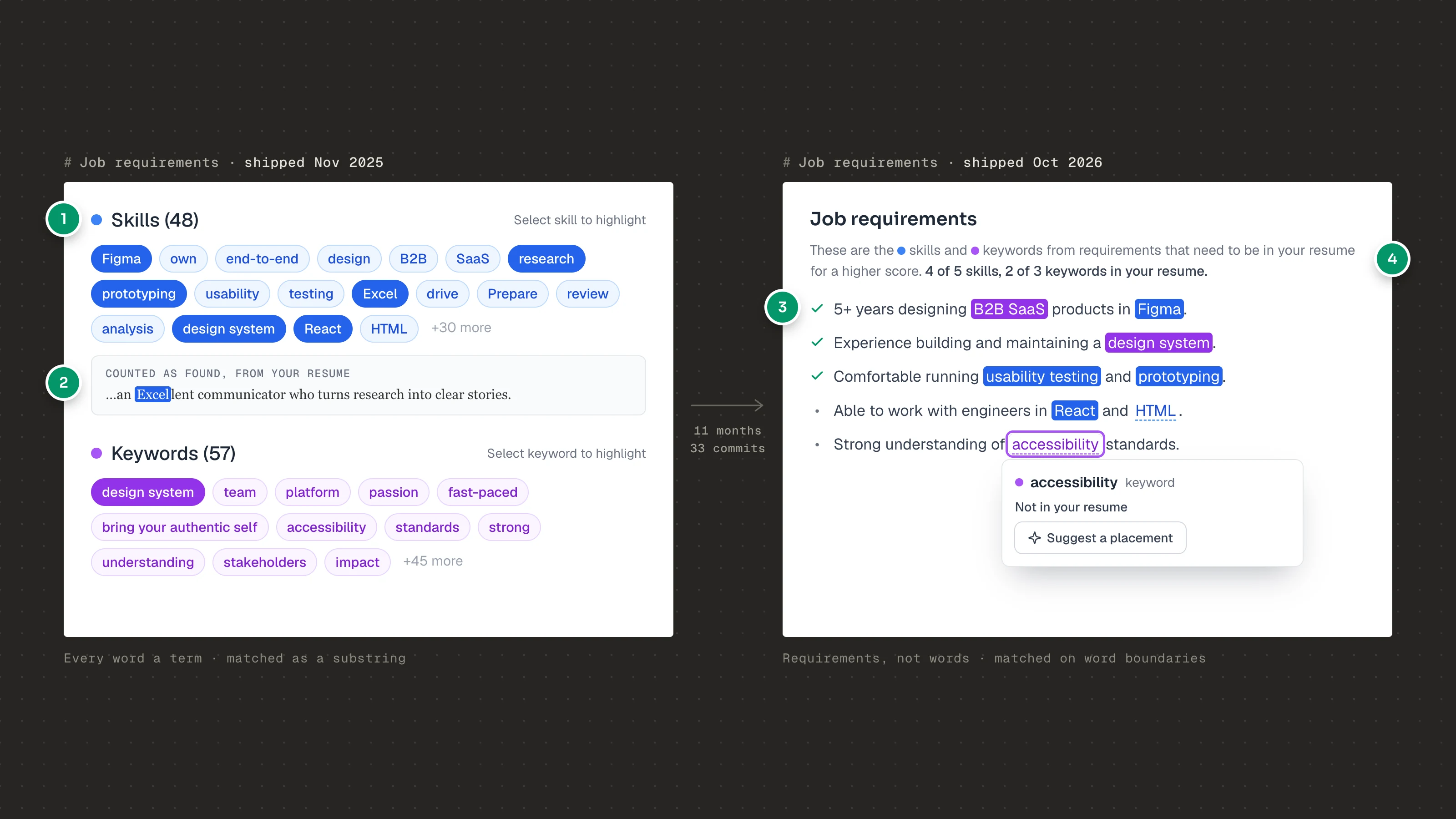
1100+ single words
2Matched by substring
3Requirements kept in their sentence
4Counted, and one click to place
Both panels rebuilt from the shipped code, November 2025 and October 2026, with the same fictional job.
Decision 1: one base resume, many tailored copies
The first question was what a “resume” even is in this product. I weighed three models:
One master resume you edit for each job. Simple, but every tailoring pass overwrites the last, and the version you sent is gone.
A master with live-synced versions. Powerful, but a fix to the master can quietly change a resume you already sent, and the merge rules are hard to explain.
A base resume you copy for each job. Each copy is yours to change. Nothing flows back.
I chose the third. You import your resume once and it becomes your base, “the starting point for all your future tailored resumes”. Each job gets its own copy. Tailoring a copy can never damage the original, and replacing the base never touches what you already sent: “Your custom variants are not affected.”
The cost is that a fix to your base doesn’t reach older copies. For people sending dozens of applications, knowing exactly what each company saw mattered more. Each copy sits on the dashboard as a card with a live preview and a status (Draft, Applied, Interviewing, Offer), so the resumes double as a light job tracker.
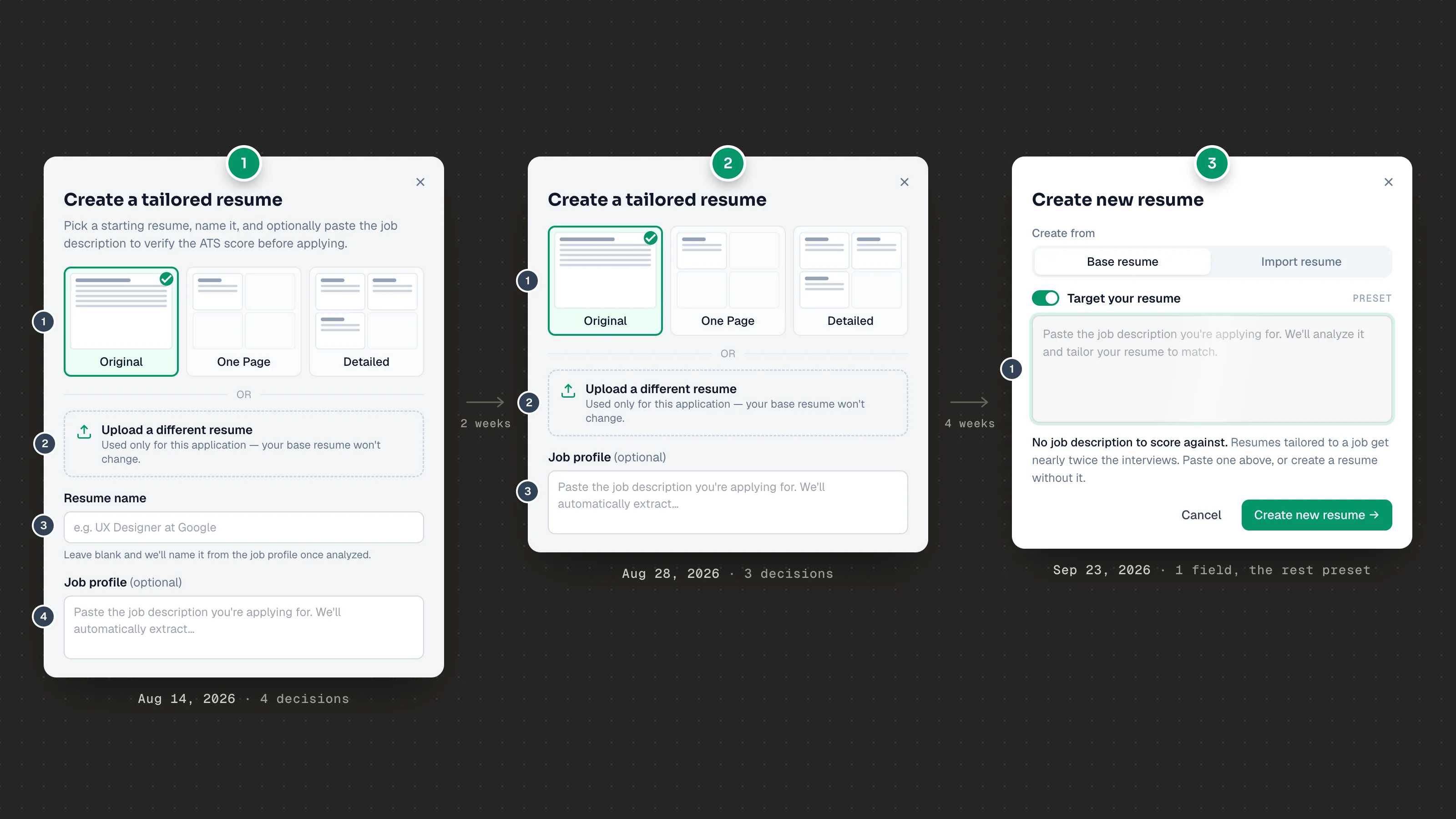
Creating a copy got simpler over time. In August 2026 it asked for a starting layout, a name and an optional job profile before you could start. Two weeks later the name went, and by late September it asked for one thing: “Paste the job description you’re applying for.” If you skip it, it doesn’t block you. It explains why it helps and lets you carry on.
The editor itself is meant to feel like writing, not filling in a form. It works like Notion: type “/” for resume blocks (Experience, Education, Skills), drag blocks by their handle, and select any text to “Ask AI” to improve it, fix the grammar, or make it shorter or longer. The AI’s suggestion appears beside your text with three choices: “Replace selection”, “Insert below” or “Discard”. Your words are never swapped out without a click.
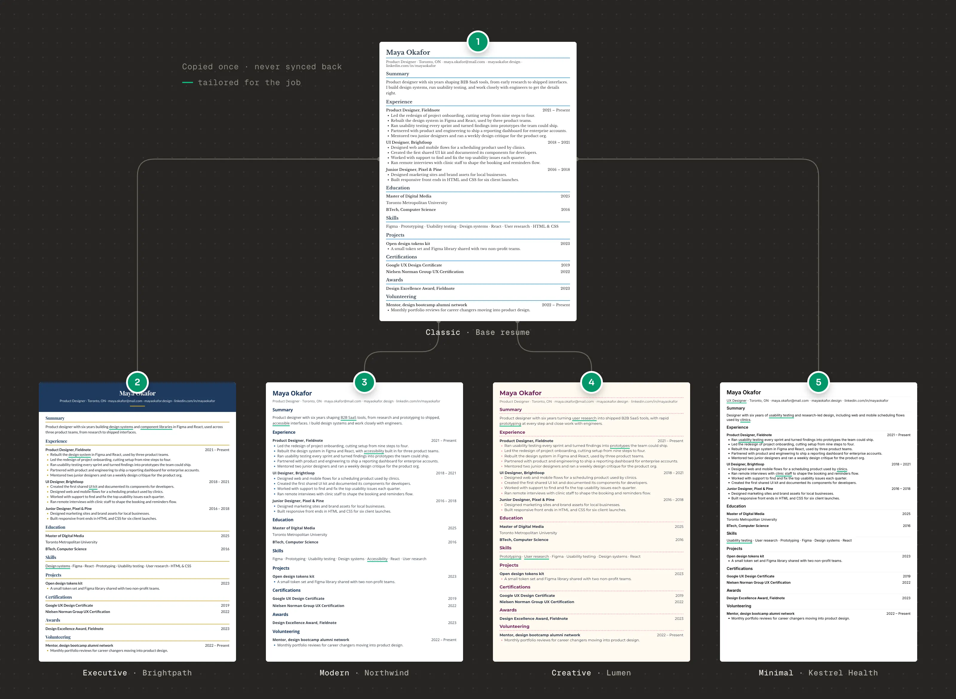
1Base resume · Product Designer
2Brightpath · Design Systems Lead
3Northwind · Senior Product Designer
4Lumen · Product Designer, AI
5Kestrel Health · UX Designer
Each copy keeps its own theme. Themes rebuilt from the product's specs; the candidate and jobs are fictional.
1Aug 2026 · pick a layout, upload, name, job profile
2Aug 2026 · name field removed
3Sep 2026 · paste the job, the rest preset
Rebuilt from the shipped code and an August 2026 screenshot.
app.wahresume.com/base-resume
I build design systems, run usability testing, and work closely with engineers to get the details right.
Experience
Product Designer, Fieldnote2021 – Present
Led the redesign of project onboarding, cutting setup from nine steps to four.
Rebuilt the design system in Figma and React, used by three product teams.
Ran usability testing every sprint and turned findings into prototypes.
Partnered with product and engineering to ship a reporting dashboard for enterprise accounts.
Press '/' for commands
Name/HeaderAdd your name as the main header.
Contact InfoAdd contact information section.
Section HeaderAdd a major section heading (Experience, Education, etc.)
SubsectionAdd a subsection (Job title, Degree, etc.)
ExperienceAdd a job experience entry.
EducationAdd an education entry.
ExperienceAdd a job experience entry.
Section HeaderAdd a major section heading (Experience, Education, etc.)
Job Title | Company Name | MM/YYYY - Present
Accomplished [X] as measured by [Y], by doing [Z].
Add more bullet points with specific achievements.
I build design systems, run usability testing, and work closely with engineers to get the details right.
Experience
Product Designer, Fieldnote2021 – Present
Led the redesign of project onboarding, cutting setup from nine steps to four.
Rebuilt the design system in Figma and React, used by three product teams.
Ran usability testing every sprint and turned findings into prototypes.
Partnered with product and engineering to ship a reporting dashboard for enterprise accounts.
Ran usability testing every sprint and turned findings into prototypes.
Led the redesign of project onboarding, cutting setup from nine steps to four.
Rebuilt the design system in Figma and React, used by three product teams.
Partnered with product and engineering to ship a reporting dashboard for enterprise accounts.
Ran usability testing every sprint and turned findings into prototypes.
Education
Master of Digital Media2025
I build design systems, run usability testing, and work closely with engineers to get the details right.
Experience
Product Designer, Fieldnote2021 – Present
Led the redesign of project onboarding, cutting setup from nine steps to four.
Rebuilt the design system in Figma and React, used by three product teams.
Ran usability testing every sprint and turned findings into prototypes.
Partnered with product and engineering to ship a reporting dashboard for enterprise accounts.Shipped an enterprise reporting dashboard with product and engineering.
Ask AIText ↗LinkBIUS<>A
Shipped an enterprise reporting dashboard with product and engineering.
Ask AI to edit or generate...
AI is thinking
Tell AI what to do next
Edit or review selectionImprove writingFix grammarMake shorterMake longerUse AI to do moreContinue writing
Replace selectionInsert belowDiscard
You
Step 1 of 3 · / commands: type "/" on a new line for resume blocks, and type to filter them.
Decision 2: a score you can act on
Most resume scanners give you a percentage and a list of missing keywords. Neither tells you where a keyword should go, or how to say it.
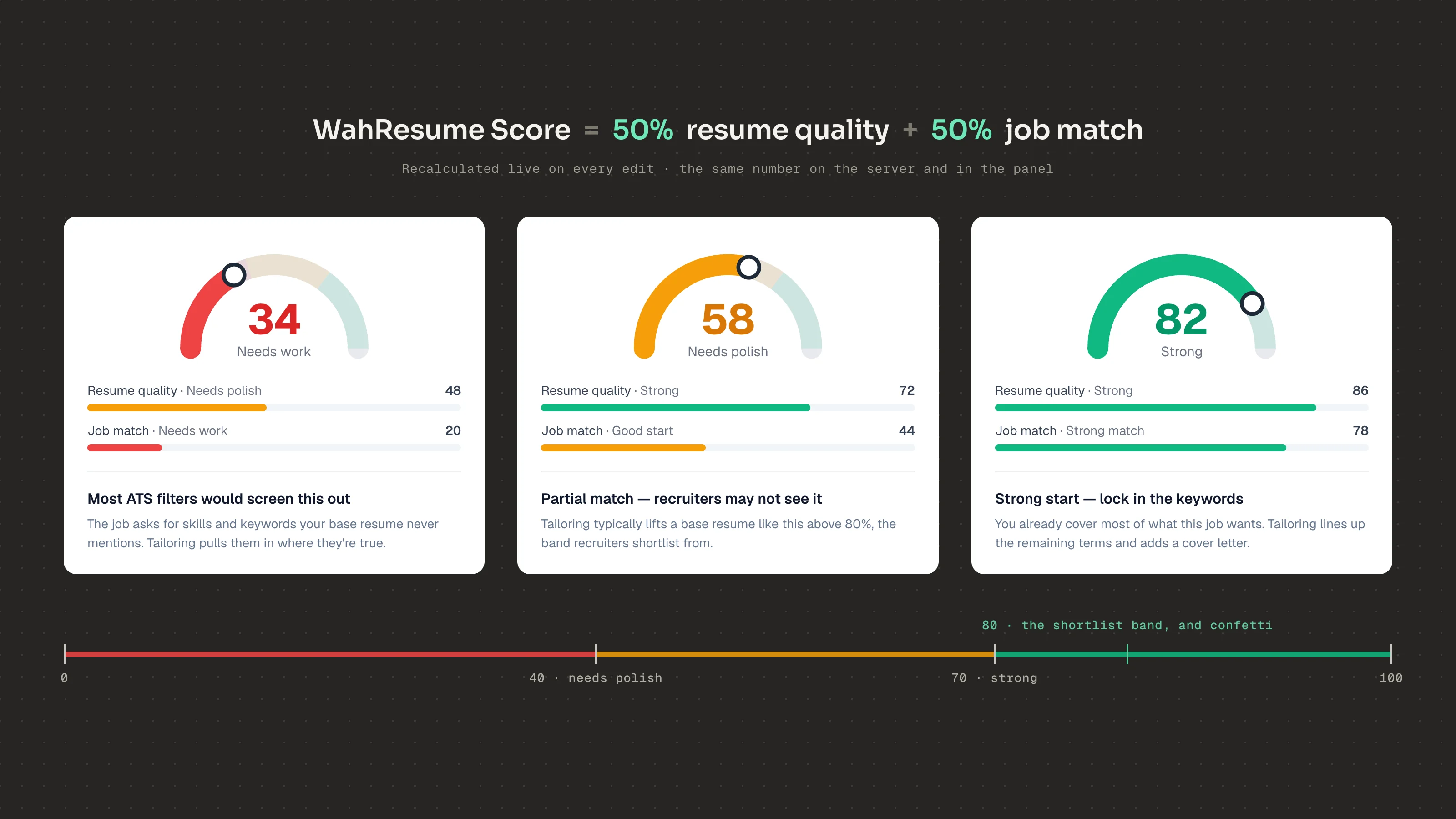
I split the problem in two. The WahResume Score is half resume quality and half job match, and it updates live as you type, so every edit shows its effect. It reads in three plain bands, “Needs work”, “Needs polish” and “Strong”, and 80 is the line recruiters shortlist from.
Below the score, the job description is shown as it was written, not boiled down into a keyword cloud. Every skill and keyword in it is highlighted in place: skills in blue, keywords in purple, solid when your resume has them, dashed when it doesn’t. Each section counts what’s left, as in “X of Y skills, A of B keywords in your resume”, and a requirement gets a check once it’s covered. You can see what the job is asking for and how much of it you’ve already said.
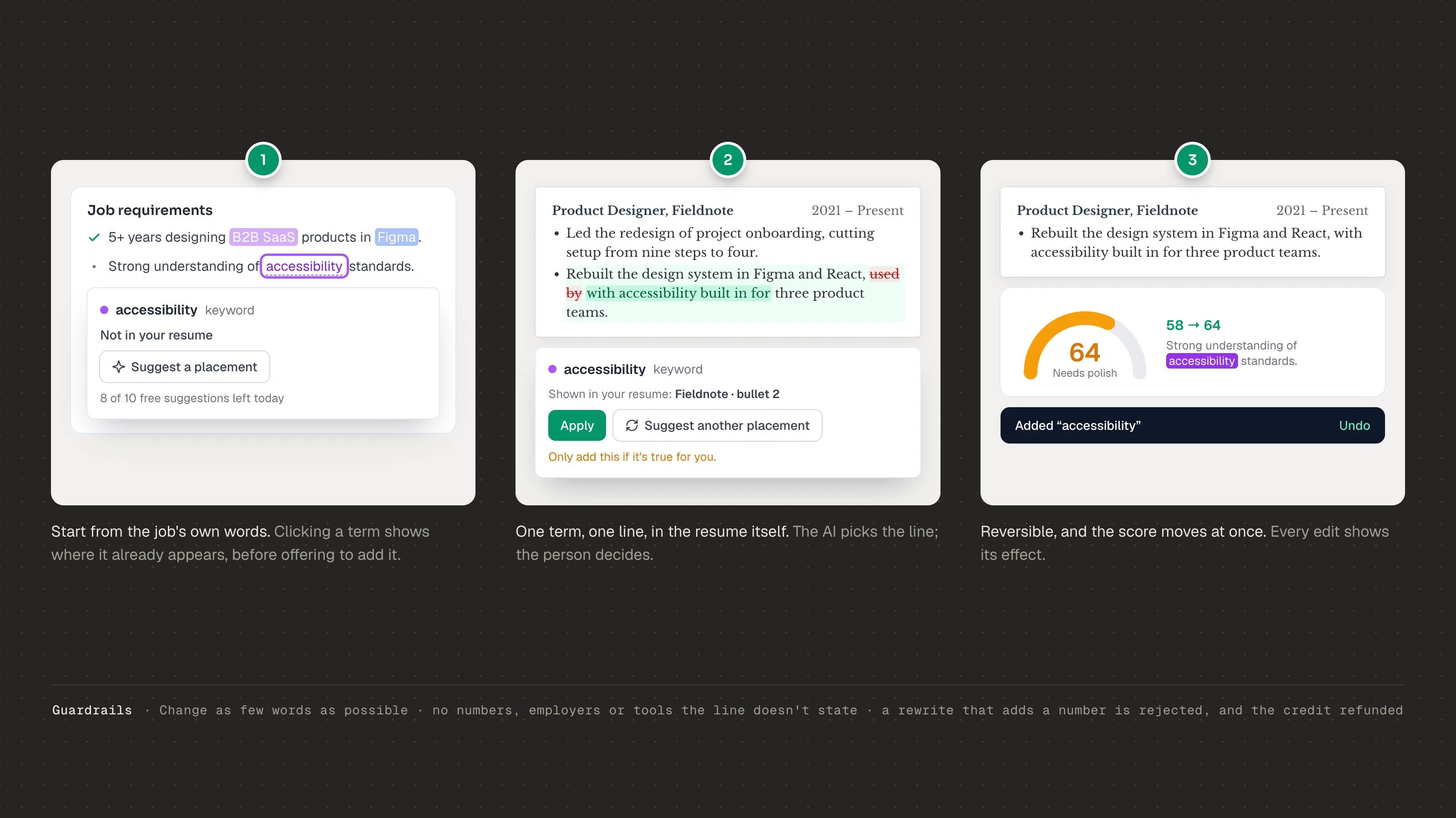
Then I made each term clickable. Click a missing term and you see where it already appears in your resume, if anywhere. Ask it to “Suggest a placement” and the AI picks one line, in your summary or one of your three most recent roles, and rewrites as few words as possible. The change previews right in your resume, crossed-out words and added words, with “Apply” or “Suggest another placement”. A line underneath says “Only add this if it’s true for you.” Applying shows an Undo.
I ruled out two easier options. A checklist alone leaves the hard part, the wording, to the user. Auto-inserting every missing term produces keyword stuffing that recruiters spot straight away. The placement flow does one term and one line at a time, and you approve each one.
1Find it in the job
2Preview it in your resume
3Apply or undo
Rebuilt from the shipped code. The candidate and job are fictional.
Bands, labels and messages from the shipped product; the example scores are illustrative.
Decision 3: Enhance as an editor, not a ghostwriter
Placement fixes one term at a time. Some resumes need a bigger pass, so I designed “Enhance”. The risk is obvious: a one-click rewrite is exactly the ghostwriter people said they didn’t want. So the design is about control at every step.
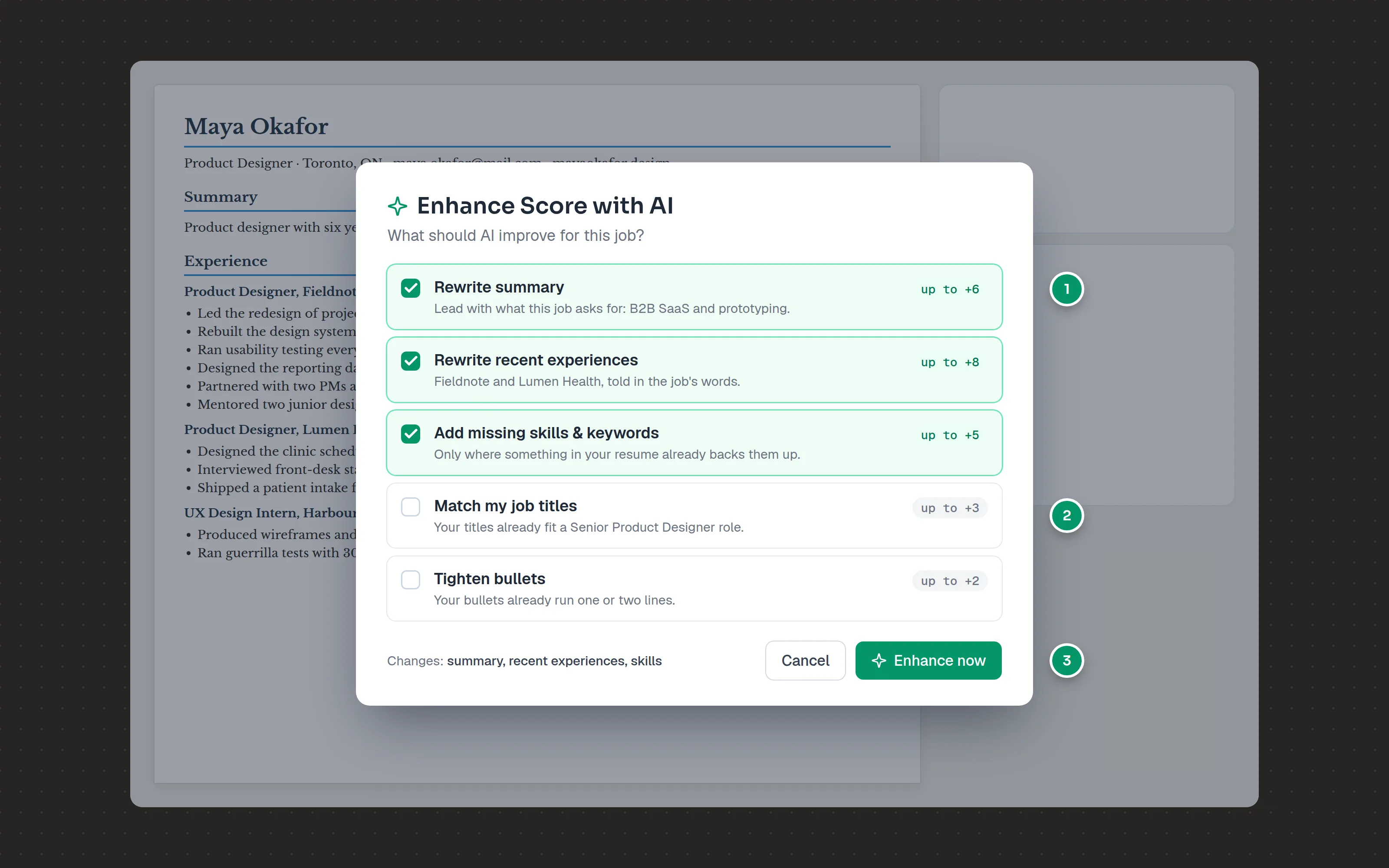
You choose what changes. A short picker asks “What should AI improve for this job?”: rewrite the summary, rewrite recent experience, add missing skills and keywords, match your job titles, tighten bullets, and more. Each option shows its likely effect on the score (“up to +N”), and only the fixes your resume needs start ticked.
1Each fix shows its likely effect
2Fixes this resume doesn't need start unticked
3Nothing runs until you say so
The candidate and job are fictional.
You see the work. While it runs, it names its steps in plain words, ending with “Checking every change against your resume”.
You compare before you commit. The result opens as a draft with an “Original | Enhanced” switch and the old score beside the new one. You can edit the enhanced version before accepting, and nothing is saved until you choose “Accept” or “Discard”.
You’re told what to check. A note says exactly what the AI added. If it estimated a number from your role, it says so and asks you to swap in your real figure.
Behind the interface are rules the AI can’t break: use only numbers that appear in your resume, never claim a seniority your latest role doesn’t show, never move a detail from one job to another. If a rewrite slips in a number you didn’t confirm, it’s thrown away, and the app says so: “The AI tried to add numbers you didn’t confirm, so we threw those changes away.”
To know whether Enhance was any good, I didn’t rely on the score alone. I wrote a ten-point quality rubric (no invented numbers, at most one added term per bullet, faithful to the source almost every time) and checked outputs against it. A model from a different family judged them blind, and I rated them myself.
app.wahresume.com/applications/northwind
Maya OkaforProduct Designer · Toronto, ON · maya.okafor@mail.com · mayaokafor.designSummary
Product designer with six years shaping B2B SaaS tools, from early research to shipped interfaces.
Experience
Product Designer, Fieldnote2021 – Present
Led the redesign of project onboarding, cutting setup from nine steps to four.
Rebuilt the design system in Figma and React, with accessibility built in for three product teams.
Ran usability testing every sprint and turned findings into prototypes.
Designed the reporting dashboard that became the most-used screen in the app, with 70% of weekly users.
Partnered with two PMs and eight engineers to scope and ship a quarterly roadmap.
Mentored two junior designers through their first year of critiques and handoffs.
Product Designer, Lumen Health2020 – 2021
Designed the clinic scheduling flow used by 400+ practices, lowering no-shows by 18%.
Interviewed front-desk staff at twelve clinics to map how bookings actually happen.
Shipped a patient intake form that cut average check-in time from eight minutes to three.
UX Design Intern, Harbour Studio2019
Produced wireframes and clickable prototypes for four client websites.
Ran guerrilla tests with 30 participants and wrote up the findings for each client.
Skills
Figma, FigJam, Framer, React, HTML & CSS, design systems, user research, usability testing, prototyping, journey mapping, workshop facilitation
Drag to compare · Enhance: rewrite summary, rewrite recent experience, add missing skills & keywords · underlines added for this case study
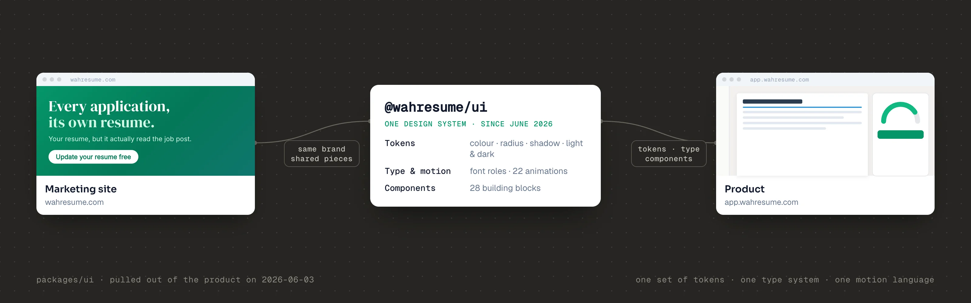
One brand, the site and the product
People meet WahResume on the marketing site and are in the product a minute later. It should feel like one product, not two.
So in June 2026 I moved the design system into one shared package that both use. It holds three things:
Tokens: colours, corner radius, shadows, and light and dark mode.
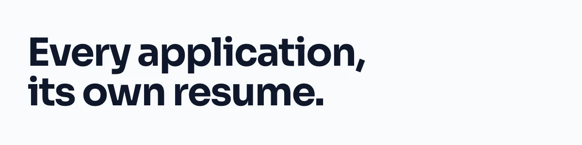
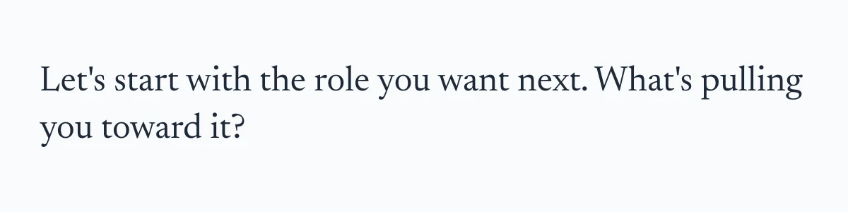
Type and motion: Geist for the product, Sora for the site’s headlines, and the small animations people see everywhere, like the scan line and the score filling up.
Components: 28 building blocks, from buttons and badges to dialogs and tabs.
The Figma library uses the same tokens, so design and code stay in step.
One set of tokens, one type system and one motion language, from the shared @wahresume/ui package.
Colour
Each colour has one job. Light and dark values come from the same token.
Primary#059669 · #059669
The brand, and the one main action on a screen.
Use for
Main buttons like “Apply”, the focus ring, active tabs, progress and step dots.
Avoid
Decoration or hover states. One primary action per area.
Contrast
White text on it: 3.8:1, fine for buttons and large text.
Background#fcfcfb · #151515
The page everything sits on.
Use for
Every screen’s base. A warm off-white, not pure white.
Avoid
Cards that need to stand out; use a border instead.
Contrast
Body text on it: 10:1.
Canvas#f2f1ee · #151515
The “desk” behind the resume page in the editor.
Use for
Editor and review screens, so the white page reads as paper.
Avoid
General backgrounds. It only exists around a document.
Contrast
In dark mode it matches the background; the white page already stands out.
Foreground#374151 · #f0efec
The main text colour.
Use for
Body copy, labels and values.
Avoid
Pure black. It looks harsh next to the warm background.
Contrast
10:1 light, 15.9:1 dark.
Muted text#6b7280 · #c3c2b7
Secondary text that supports the main line.
Use for
Descriptions, placeholders, helper lines like “You’ve used all 5 free enhancement attempts.”
Avoid
Anything people must read to act, such as errors or prices.
Contrast
4.7:1, passes AA for body text.
Border#e5e7eb · #292929
Quiet structure between things.
Use for
Cards, dialogs, tooltips, outline buttons and inputs.
Avoid
Being the only sign of a state; pair it with text or an icon.
Contrast
Decorative only (1.2:1), never the sole cue.
Destructive#ef4444 · #ef4444
Actions you can’t undo, and errors.
Use for
“Delete” in “Delete this application?”, error text and error cards.
Avoid
Warnings or anything reversible. Use sparingly.
Contrast
White text on it: 3.8:1, for buttons only.
Hover#f3f4f6 · #454545
The light wash when you point at something.
Use for
Menus, ghost and outline buttons, list rows.
Avoid
Brand colour. An emerald hover made every hover look like a brand moment, so it’s neutral.
Contrast
A state cue; text keeps its own colour.
Type
Three faces, three roles. The product runs on one face; the other two carry the brand and the coach.
Geist
The product’s voice: every screen, button and label.
Sizes
14px body · 12px meta · 18px semibold titles · 12px semibold badges
Why
14px is the standard size for dense SaaS tools, so long sessions stay comfortable.
Sora
The marketing site’s display face.
Sizes
Hero and page headlines, big calls to action
Why
Geometric and confident at large sizes, it carries the brand where people first meet it.
Newsreader
The coach’s voice.
Sizes
Coach messages, 400 and 600
Why
A warmer serif marks a person-like voice. Chosen because it ships a real bold, not a faked one.
Values from the shared tokens and the product’s overrides. The coach line is a sample.
The product takes its components straight from the package. Change the button once and every button in the product updates. Every core component has a Storybook story with accessibility checks. A few product choices sit on top, like warmer greys for the editor and a neutral hover, so green stays a brand colour and not decoration. On top of the shared set, the product has its own components for the jobs only WahResume does.
Custom Components
Four components built for WahResume on top of the shared set, where a general one couldn’t do the job.
01
Score gauge
Shows the WahResume Score, its band, and how far a resume is from the shortlist.
Score panel
34Needs work
58Needs polish
82Strong
123456
Most ATS filters would screen this out
Resume quality · Needs work48
Job match · Needs work20
Before enhancing: 64%
Partial match — recruiters may not see it
Resume quality · Strong72
Job match · Good start44
Before enhancing: 64%
Strong start — lock in the keywords
Resume quality · Strong86
Job match · Strong match78
Before enhancing: 64%
1Band scale: red to 40, amber to 70, green above
2Fill, in the band’s colour, eased on every change
3Value, set large in tabular figures
4Band, in words, so colour never carries it alone
5Previous score, shown after Enhance
680, the shortlist line
Card · score panel
Job match and resume quality, live as you edit.
Row · beside the editor
WahResume Score 82% · Strong
Inline · under the job title
Before enhancing: 64%
After Enhance
Why custom
A progress bar says how much is done. This says how good it is: the band, the shortlist line and the two halves of the score, quality and job match.
Behaviour
Recalculates on every edit. The fill eases to the new value and changes colour as it crosses 40 and 70, so a single change reads as movement.
Accessibility
A meter, not a progress bar, with a value text like “82, Strong”. The band is always written out; colour only repeats it.
02
Term highlight & job requirements
Marks every skill and keyword in the job’s own sentences, and whether the resume has it.
Job requirements
Job requirementsFound skillkeyword
14 of 5 skills, 2 of 3 keywords in your resume.
5+ years designing products in .2
Experience building and maintaining a .
•Strong understanding of standards.3
Comfortable running and .4
•Builds in and documents components in .
In your resume
Hover or focus a term to see where it appears.
“accessibility” isn’t in your resume yet. Suggest a placement
“Storybook” isn’t in your resume.
Product designer with six years shaping B2B SaaS tools, from early research to shipped interfaces.
Rebuilt the design system in Figma and React, used by three product teams.
Ran usability testing every sprint and turned findings into prototypes.
2Found: solid fill, blue for skills, purple for keywords
3Missing: dashed underline, ringed when selected
4Check once every term in the line is covered
Figma
Skill · found
B2B SaaS
Keyword · found
Storybookaccessibility
Missing · dashed
accessibility
Selected · ring
Excellent communicator“Excel” counted as found
Don’t · match inside words
Why custom
A badge cloud lost the job’s context and counted “Excel” inside “Excellent”. This keeps the job as written and matches whole words, so a requirement reads as a sentence.
Behaviour
Clicking a term shows where it already appears. A missing one offers “Suggest a placement”. The counts and checks update as the resume changes.
Accessibility
Each term is a button named with its kind and status, like “accessibility, keyword, not in your resume”. Found and missing differ by fill and line, not hue.
03
Inline diff mark
Previews an AI edit inside the resume, word by word, before anything is saved.
Resume editor
Product Designer, Fieldnote 2021 – Present
Rebuilt the design system in Figma and React,1removed: used by2added: with accessibility built in for three product teams.3
ApplySuggest another placementOnly add this if it’s true for you.Added “accessibility” UndoChange undone · the line is as you wrote it
1Removed: struck through in red, still readable
2Added: green wash with an underline
3Context: the rest of the line, untouched
…React, used by with accessibility built in for three…
Proposed · in place
…React, with accessibility built in for three…
Added “accessibility” Undo
Applied · with Undo
Rebuilt the design system in Figma and React, used by three product teams. Spearheaded an accessible, scalable design system empowering teams.
Don’t · rewrite the whole line
Why custom
People said they wanted to see what changed. A before-and-after dialog hides the edit; marking it in the resume shows exactly which words moved.
Behaviour
As few words as possible, and no numbers, employers or tools the line doesn’t state. Apply settles the line with a brief wash and an Undo.
Accessibility
Real del and ins with hidden “removed” and “added” text, since most screen readers skip them. Strikethrough and underline survive forced colours.
04
Ask AI selection toolbar
The floating menu on any selected text: format it, or hand it to AI and decide what to do with the answer.
Resume editor
Product Designer, Fieldnote 2021 – Present
Led the redesign of project onboarding, cutting setup from nine steps to four.
2Ask AIText↗LinkA
1Ran usability testing every sprint and turned findings into prototypes.
5Turned sprint usability tests into prototypes.
3Ask AI to edit or generate…
Tell AI what to do next
4Edit or review selectionImprove writingFix grammarMake shorterMake longerUse AI to do moreContinue writing
Replace selectionInsert belowDiscard
Designed the reporting dashboard that became the most-used screen in the app, with 70% of weekly users.
Partnered with two PMs and eight engineers to scope and ship a quarterly roadmap.
Mentored two junior designers through their first year of critiques and handoffs.
1Selection: any text in the resume
2Ask AI, first in the formatting bubble
3Prompt: type any instruction
4Preset edits for the selection
5The answer, then replace, insert below or discard
AI is thinking
Thinking
Make it sound less formal
Your own instruction
Ask AI to edit or generate…2 of 3 free AI edits left
Guest · free edits
You’ve used your 3 free AI editsSign up free to keep improving your resume with AI.Sign up to keep editing
Guest · limit reached
Why custom
The editor’s selection bubble only formats. WahResume puts Ask AI first in it and opens a command panel: preset edits, your own instruction, and an answer that waits until you choose what to do with it.
Behaviour
Ask AI swaps the bubble for the panel below the selection, which stays highlighted. The answer streams in; you can refine it with “Tell AI what to do next”. Guests get three free edits.
Accessibility
A command menu: the prompt takes focus when it opens, arrow keys move through the actions and Enter runs one. Every icon-only format button is labelled.
The site shares the same colours, type, logo and dark mode, and uses shared pieces such as the share button. Moving the rest of it onto the package is next.
Accessibility was built in from the start: keyboard navigation, visible focus, and focus that stays inside open dialogs.
Results
WahResume has 12,000+ users. It now covers the full loop: a base resume, tailored copies with live scores, one-line keyword placement, Enhance with review, cover letters that cover the terms the resume misses, and mock interview practice.
What I’d do next
The product still has gaps, and they’re the next things I’d design:
Accept changes one at a time in Enhance. Today it’s accept all or discard all. The engine already tracks each change; the review screen should let you keep some and drop others.
One consistent signal for AI. AI actions currently use more than one icon and colour. A single, consistent marker, as a design token both surfaces share, would make it obvious what the AI touched.
Version history. Copies protect the base, but within a copy, the only undo is the editor’s own.
Save status on desktop. It shows on phones but not on larger screens, where most editing happens.